Ligature Logo
- Dec 2, 2016
- 1 min read
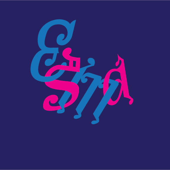

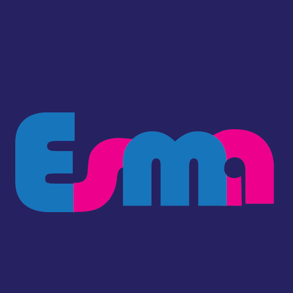

What is a ligature logo?
-It’s using creativity and letters to form cool designs or logos that represent something
How would describe the corporate identity of ESMA in 5 words?
-Annoying –cool –fun –stressful
Which logo out of the two do you feel is the strongest and why?
-My strongest one would be my first one the black and white one.
If you had no requirements or restrictions how would your logo look different?
-Yes very different because it probably wouldn’t look at good if tried somet6hing else
Explain which ligature techniques you have demonstrated on each logo:
-Curved to vertical
-Interlock
-crop!


Comments